


The World’s population mapped by who is online
What would the world look like if countries were sized by the number of people online?
With only a third of the world having access to the internet, many countries would virtually disappear from the map. Africa, with the exception of Nigeria and Egypt, would shrink substantially, while Germany, France and the UK would swell, making Europe as a whole gargantuan.
China and India’s huge populations make up for the fact both countries have a smaller percentage of online users.
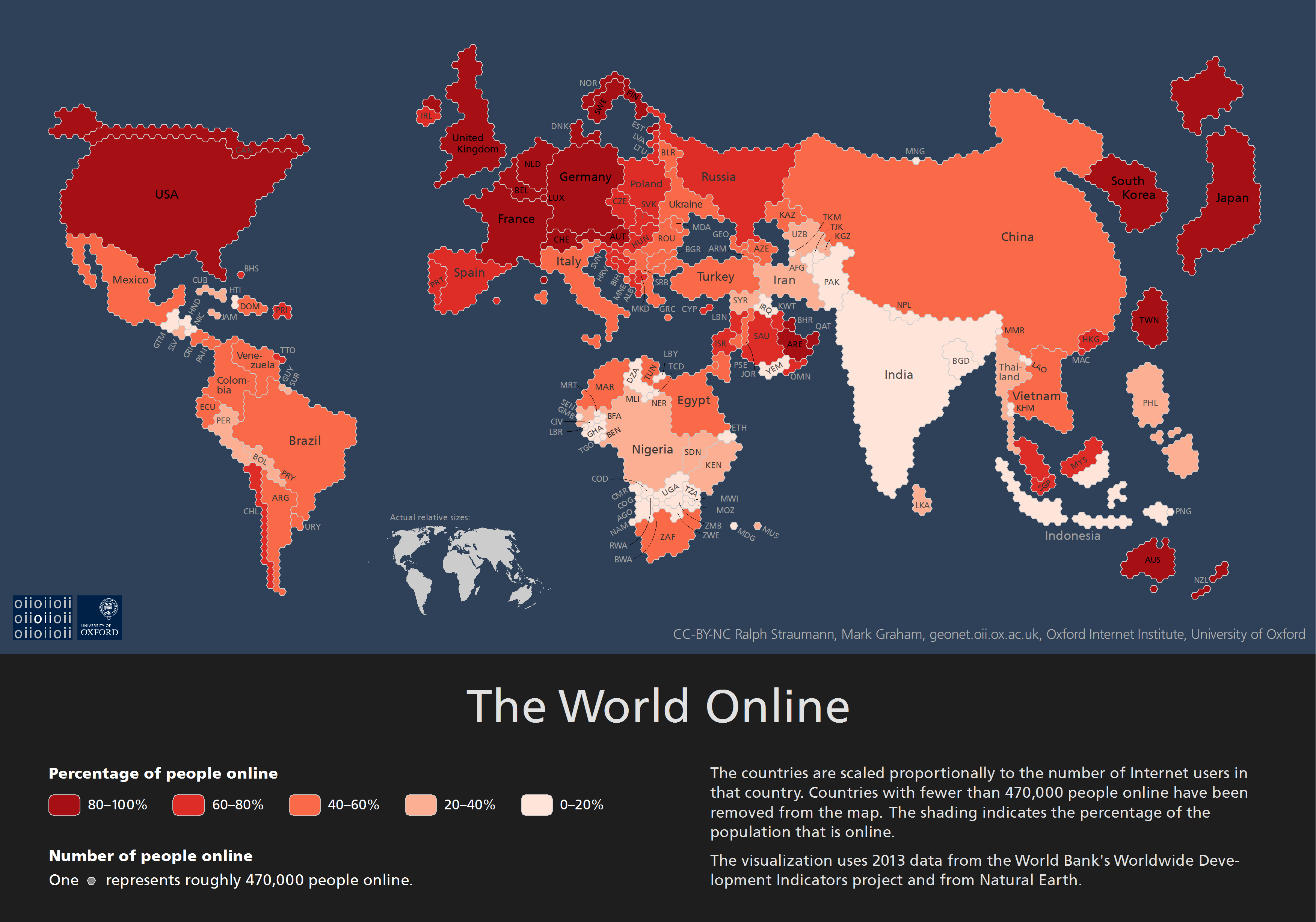
Oxford University’s Internet Institute built the above visualization using 2013 data from the World Bank. The map shows that Asia has 1.24 billion internet users, just under half of the world’s total.

China has the most internet users in the world, with 600 million people online, followed by the United States (270 million), India (190 million) and Japan (110 million).
Outside of Europe, North America and Oceania, only five countries have over 80% of the total population online. Those countries are Japan, South Korea, Bahrain, Qatar and the United Arab Emirates.
The map was made by sizing each country based on the absolute number of internet users, while keeping the countries’ and continents’ real shapes.

")


")


