


Mapping the Migration of the World’s MillionairesPublished 6 days ago on June 15, 2022
By Carmen Ang
Graphics/Design:
Nick Routley
Tweet
Share
Share
Reddit
Email
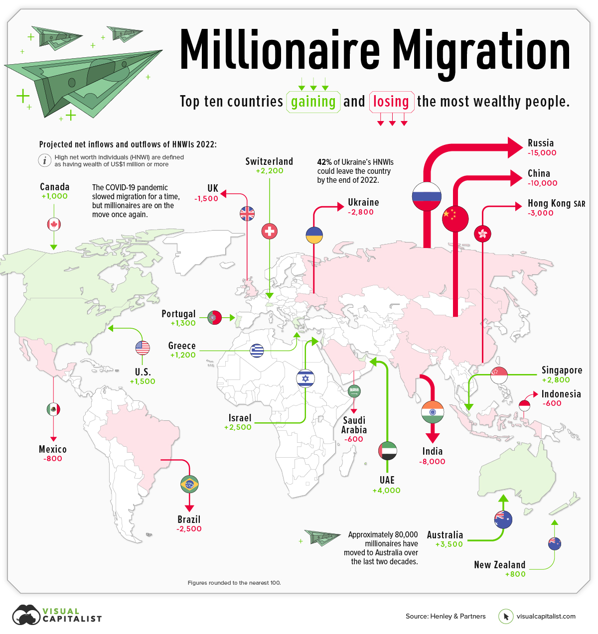
world map showing millionaire migration in 2022
▼ Use This Visualization
Mapping the Migration of the World’s Millionaires
Throughout 2022, a projected 88,000 millionaires will move to a new country, according to the latest Henley Global Citizens Report.
Which countries are these millionaires moving to, and where in the world are they coming from?

This graphic maps the migration of high net worth individuals (HNWIs)—people with a net worth of over US$1 million—showing where rich people are flocking, and where they’re fleeing.
Migration of Millionaires is Back
Before diving into the country-specific data, it’s worth taking a step back to look at overall millionaire migration trends, and how things are changing this year.
2020 saw a drastic drop in the number of millionaire migrants, as pandemic-induced lockdowns kept people from leaving their home countries—and at times, their homes in general.
But as restrictions ease and countries begin to open up their borders again, the migration of millionaires is beginning to gather steam once again:
Year # of HNWIs that migrated Y-o-y change
2018 108,000 14%
2019 110,000 2%
2020 12,000 -89%
2021 25,000 108%
2022P 88,000 252%
2023P 125,000 42%
Below, we’ll dive into which countries are seeing the highest number of HNWI migrants, and which ones are losing the most HNWIs.
Which Countries Are Millionaires Leaving?
There are a plethora of reasons why the ultra-rich move countries. Escaping conflict is one of them, which is why it’s no surprise to see Russia and Ukraine are projected to see some of the biggest emigration numbers by the end of 2022.
Here are the top 10 countries by millionaire outflows:
Country Projected net outflows of HNWIs (2022) % of HNWIs lost
🇷🇺 Russia 15,000 15%
🇨🇳 China 10,000 1%
🇮🇳 India 8,000 2%
🇭🇰 Hong Kong 3,000 2%
🇺🇦 Ukraine 2,800 42%
🇧🇷 Brazil 2,500 2%
🇬🇧 UK 1,500 0%
🇲🇽 Mexico 800 0%
🇸🇦 Saudi Arabia 600 1%
🇮🇩 Indonesia 600 1%
Figures rounded to the nearest 100.
While Russia is expected to see 15,000 millionaires leaving the country, Ukraine is projected to experience the highest loss in percentage terms—a whopping 42% of its HNWIs could leave the country by the end of 2022.
China could also see a big loss in its millionaire population, with a projected loss of 10,000.
According to Andrew Amoils, Head of Research at New World Wealth, this could be more damaging to the country than in previous years, since general wealth growth in China has declined recently.
Where Are The Ultra-Rich Moving?
The United Arab Emirates (UAE) has become a millionaire magnet, with a projected 4,000 HNWIs flowing into the country by the end of 2022. This influx of ultra-wealthy people is partly because of the country’s accommodating immigration policies that are specially tailored to attract private wealth and international talent.
Here are the top 10 countries that saw millionaire inflows:
Country Projected net inflows of HNWIs (2022) % of HNWI Gained
🇦🇪 UAE 4,000 4%
🇦🇺 Australia 3,500 1%
🇸🇬 Singapore 2,800 1%
🇮🇱 Israel 2,500 2%
🇺🇸 USA 1,500 0%
🇵🇹 Portugal 1,300 2%
🇬🇷 Greece 1,200 3%
🇨🇦 Canada 1,000 0%
🇳🇿 New Zealand 800 1%
Australia continues to attract HNWIs, coming in second behind the UAE. According to New World Wealth, approximately 80,000 millionaires have moved to the Land Down Under in the last two decades.
A few things that attract migrants to Australia are the country’s low costs of healthcare, its lack of inheritance tax, and its generally prosperous economy.
Where does this data come from?
Source: Henley Global Citizens Report 2022
Data notes: As countries reopen, and the invasion of Ukraine wears on, this will have ripple effects on where people choose to live. There are two main things to keep in mind when view the information above. 1) Individuals need to remain in a country for six months in order to be updated in the database. In many cases, it’s not yet clear where people leaving certain countries choosing to relocate. 2) In the graphic above, we’ve visualized the top 10 countries for inflows and outflows.
Update: This article and graphic have been updated to more clearly explain what’s being shown, and list the data source in a more prominent way. We appreciate your feedback.


")


? Here Are 5 Easy Steps!")
